PILLA

Project Overview
In the 21st century everything is moving fast, busy, and in a constant state of change, from our day to day to private lives humans have become adjusted to always moving, With this, it’s become a task for some to remember tasks, especially medical responsibilities. Pilla is an app that makes this easy.
TIMEFRAME
4 WEEKS
MY ROLE
UX & UI DESIGN, VISUAL DESIGN, BRANDING, USER FLOW, RESEARCH, PROTOTYPING & TESTING
TOOLS
FIGMA, GOOGLE FORMS, GOOGLE SLIDES
CHALLENGE
THE PROBLEM
Users find remembering to take pills is hard with a busy schedule & apps currently can’t manage pills with simple & intuitive design.
OBJECTIVE
the goal
Creating an app that is accessible, simple & intuitive for patients/users to use.
EMPATHIZE
RESEARCH
key questions
how accessible does this app need to be?
WHAT I FOUND
making the app free to all users with no paywall increases accessibility.
COMPETITIVE MARKET ANALYSIS
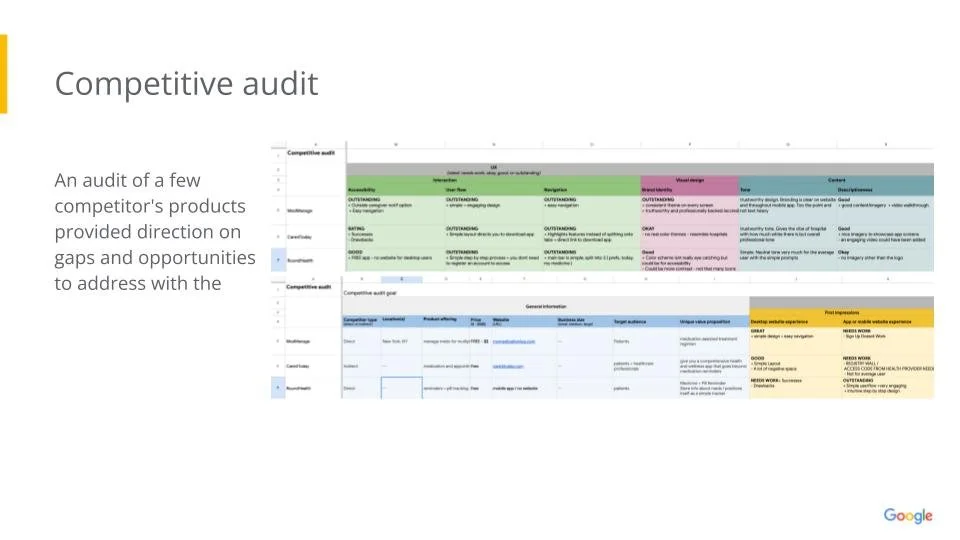
I conducted a competitive market audit of competitors like MedManage, Roundhealth, & Care4today. Roundhealth & Care4today have since been dissolved however all were aligned with the goal for Pilla. I focused on the features and aesthetic of all to see where strengths and weaknesses are and identifying the gaps that Pilla could improve on.
HOW BENEFICIAL IS ICONOGRAPHY?
IS THIS WITH THE MEDICAL INDUSTRY IN MIND OR THE COMMON individual?
BRANDING & ICONOGRAPHY AREN’T AS PROMINENT DUE TO MEDICAL FIELD.
combining features for MEDICAL HAS ADVANTAGES BUT THE COMMON USER NEEDS TO BE PRIORITIZED.
DEFINE
USER PERSONA
POINT OF VIEW
IDEATE
USER FLOW
LOFI WIREFRAMES
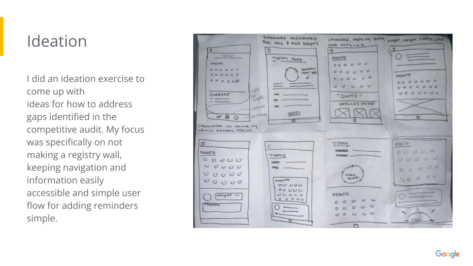
I did an ideation exercise to come up with ideas for how to address gaps identified in the competitive audit. My focus was specifically on not making a registry wall, keeping navigation and information easily accessible and keeping user flow for adding reminders simple.
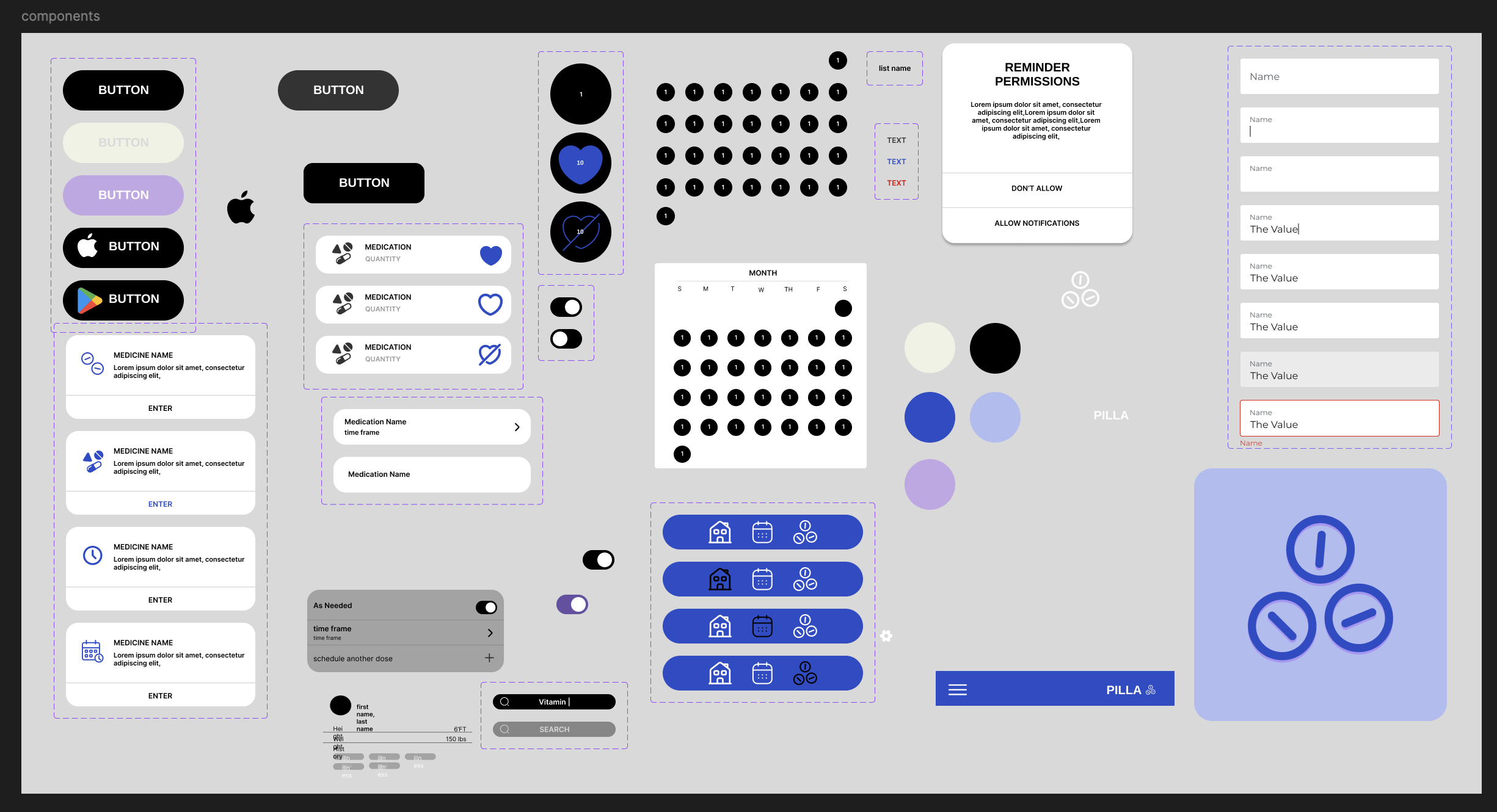
BRANDING
TYPOGRAPHY
TYPEFACE - INTER
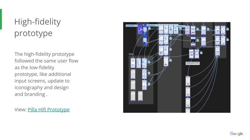
hifi wireframes
COLOR PALETTE
VALIDATE
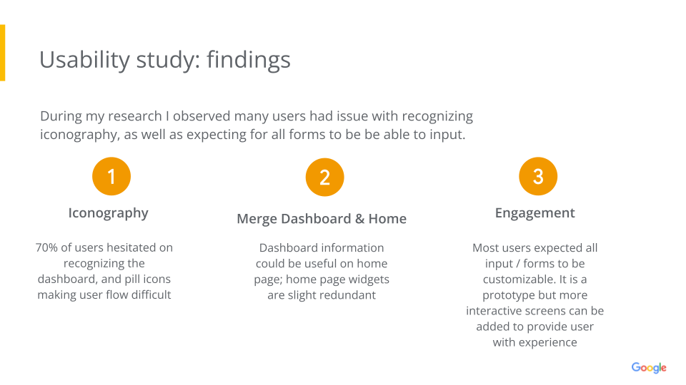
USABILITY TESTING & RESULTS
MOVING FORWARD
Users didn’t have too much complication outside of not understanding some icons, and being unsure on what to do on prompt screens; thus highlighting some pain points. Users liked the option to make an account or continue as a guest and found the over all app design simple and easy to use